Creating a Logo for Wilkinson Visual: the Process, Collaborators, and the Final Design
In the last 4-6 months, I've been slowly working on re-aligning the focus of Wilkinson Visual, and strategizing on where and how to proceed next. As part of that process, I wanted to actually create a proper logo and rewrite what is basically the mission of the business, so that potential clients would know exactly the kind of work we specialize in, and hopefully get us better SEO ranking.
I considered hiring a designer, but wanted to try my hand at it first. With a bit of a design background, and full knowledge of what the "brand" needed to represent, I spent a few weeks coming up with some different design concepts.
Green was the one color I wanted in there, representing the natural world. The inclusion of mountains became a graphical element I experimented with as well, often trying to work in the W and V into the shape of those elements. Even though I liked some of the designs with heavy letterforms and strong contrast, I ultimately felt they didn't reflect the identity of the business and were "too loud."
I wanted something that was simplistic, quiet, could work in black and white, and visually represented the kind of work we do (outdoor documentary videos and photography.) Kind of a tall order, but I took my time to explore different ideas and flesh out potential concepts before deciding if it was working or wasn't.
Exploring other filmmakers' logos was an important part of that process, although in my research I only even found a few that I liked. Most didn't even have a logo, they just had their name set in a special font or in bold, which is how I've done my business name for many years.
Here was what just ONE of my artboarda looked like as I was going through different iterations of these concepts. I had two others, plus hand-drawn sketches.
About 6 weeks in, my eyes were getting a bit numb to these. I was having trouble seeing the garbage concepts from the functional ones. It was at this point that I took a break for about a week, but as luck would have it, I met a local graphic designer right around the same time. It was during a tourism video shoot where I ran into Chelsea Jones, a graphic designer in Mancos, who had plenty of experience with smaller businesses developing a visual identity.
With more than a few concepts to start from, we collaborated on a few new ideas, and refined existing ones. It was so refreshing to get a new set of eyes on things, and it really helped to have a new subjective opinion.
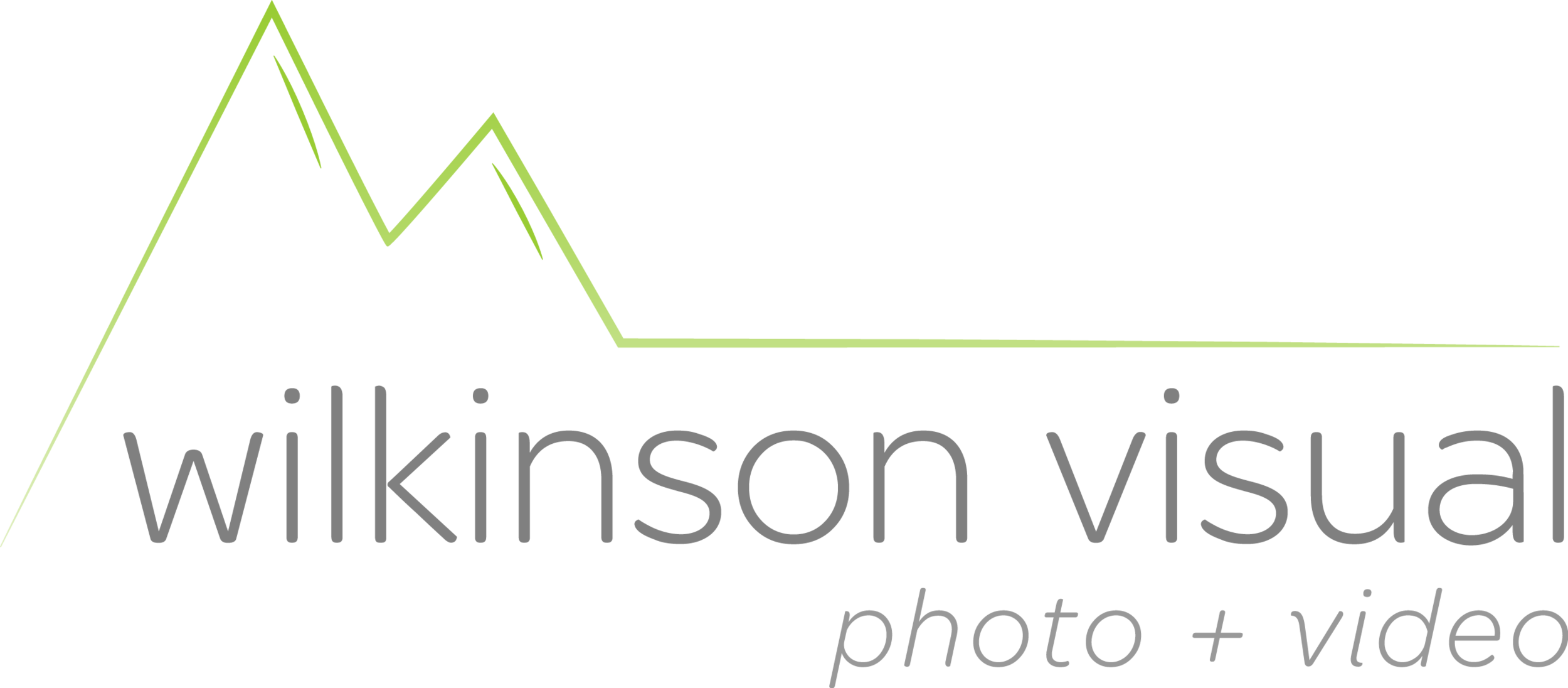
After what she came up with, I made a few very minor tweaks and then settled on this for the final logo, which is what you see in the top left corner of this website:
